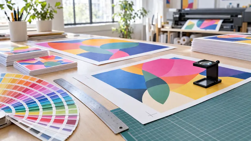
CMYK or RGB: which colour mode to choose for print
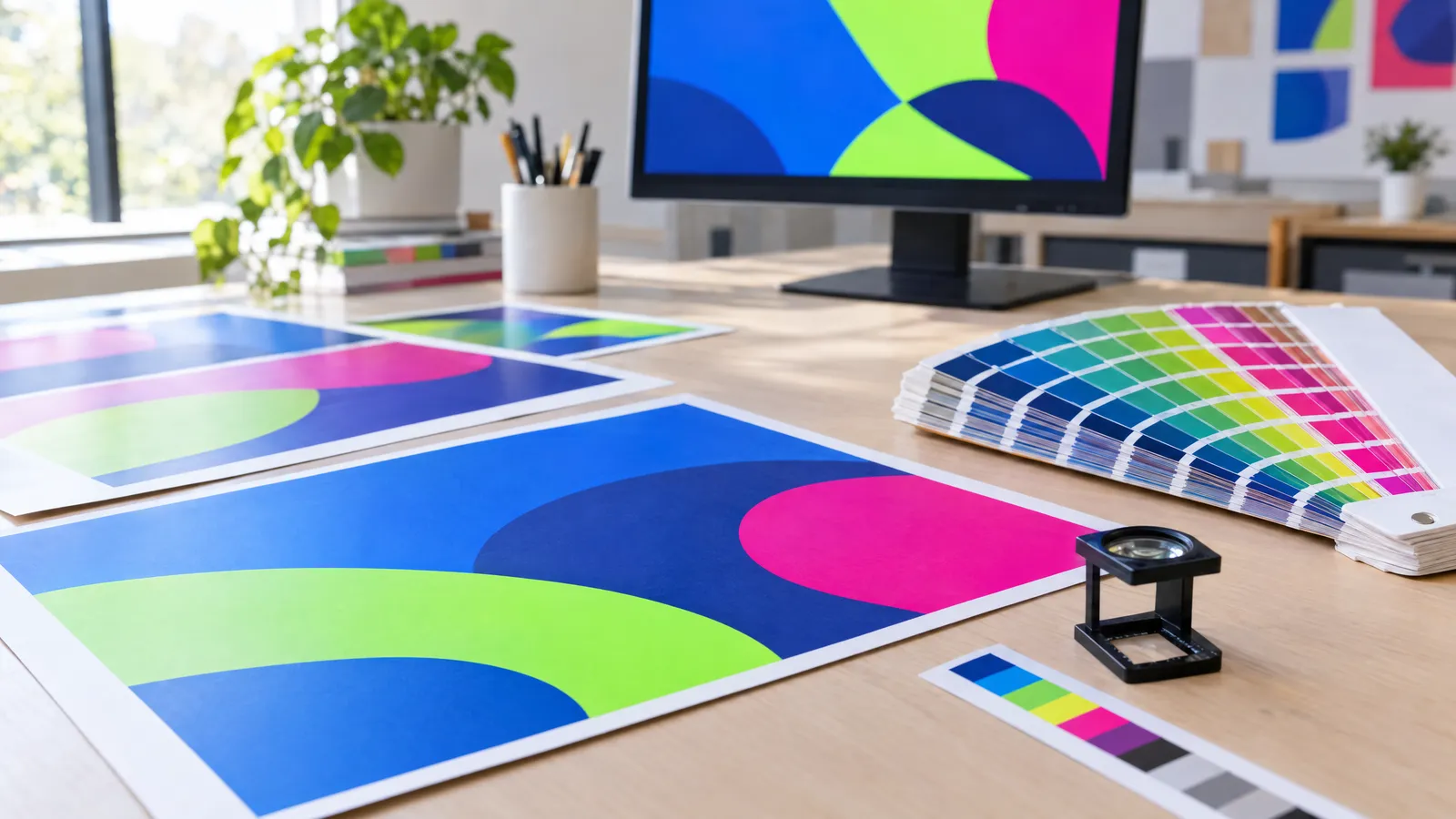
For offset and most digital printing, prepare your file in CMYK with the ICC profile specified by your printer (for coated paper this is usually FOGRA39 or FOGRA51), at 300 DPI at 1:1 scale, with 3 mm bleed and a total ink coverage of no more than 300–330%. Keep RGB, ideally sRGB, for screens: posts at 1080×1080 px, stories at 1080×1920 px and web banners. Some large-format and UV printers accept RGB and convert the colours themselves in their RIP, but always check before sending your file.
Your design looks great on the monitor, but once printed the blue turns purple and the neon green looks more like olive. That isn't the printer's fault; it's the difference between light from a screen and ink on paper. In this guide I explain how CMYK and RGB differ, which colours cause trouble in print, how to choose the right ICC profile and when it's perfectly fine to leave your file in RGB.
What is the difference between CMYK and RGB?
RGB is an additive model: colours are created by mixing red, green and blue light, and all three combined produce white. This is how every monitor, phone and television works. CMYK is a subtractive model: cyan, magenta, yellow and black inks absorb part of the light reflected from the substrate, and the more ink you lay down, the darker the result.
The most important practical difference is gamut, the range of colours that can be reproduced. The RGB gamut is noticeably larger, especially in bright greens, intense blues, oranges and purples. Any colour outside the CMYK gamut will be replaced during conversion by the nearest achievable colour, which is usually duller.
| Feature | RGB | CMYK |
|---|---|---|
| How colour is created | Mixing light (additive) | Mixing inks (subtractive) |
| Channels | R, G, B (0–255) | C, M, Y, K (0–100%) |
| Colour range | Wide, very saturated colours | Narrower, depends on paper and press |
| Use | Screens, social media, websites | Offset and digital printing |
| Typical profile | sRGB, Adobe RGB | FOGRA39, FOGRA51, FOGRA52 |
| Resolution | In pixels, e.g. 1080×1080 px | In DPI, usually 300 DPI at 1:1 scale |
Why do colours on screen come out differently in print?
A monitor emits its own light, whereas a print only reflects the ambient light around it. That's why even a perfectly prepared CMYK file will look less vivid on paper than on a backlit screen, particularly in a dimly lit office. Then there's calibration: an uncalibrated monitor, especially on a laptop or phone, often misrepresents saturation and brightness.
The second reason is the substrate. The same file will look different on coated art paper, uncoated offset paper and a PVC banner, because uncoated paper absorbs ink, making colours darker and less saturated. The third reason is conversion: if you send RGB and the printer or the printer driver converts it to CMYK automatically, it isn't you who decides how out-of-gamut colours are handled.
- Turn on CMYK colour preview (soft proofing) in your design software using the printer's profile.
- Judge colours on a calibrated monitor with brightness reduced to around 100–120 cd/m², not on your phone.
- For important print runs, order a proof or a test print on the final substrate.
Which colours are difficult to print in CMYK?
The problem mainly affects colours that are both highly saturated and bright. The classic example is pure RGB blue 0/0/255: after conversion it picks up a lot of magenta and prints looking purple. Likewise, neon green, pink and orange lose their 'glow', because no combination of the four process inks can reproduce fluorescence.
If a particular colour is key to your brand, you have two options: choose the closest achievable CMYK equivalent and accept it knowingly, or print with an additional spot colour, for example from the Pantone guide. Pantone fluorescent colours (the 801–814 series) are available in offset and screen printing, but not in every digital process, so ask your printer before you design a neon poster.
- Neons (green, pink, yellow, orange): they will always look duller in CMYK; the solution is fluorescent inks or strong contrast against a dark background.
- Intense blue: instead of RGB 0/0/255, set something like C100 M70 Y0 K0 and don't push magenta close to the cyan value, or the colour will drift into purple.
- Bright green: keep magenta at 0% and use cyan with yellow without black, otherwise the colour will look muddy.
- Deep purple and turquoise: check them in CMYK preview, as the difference is often greatest here.
- Large black areas: use rich black, e.g. C60 M40 Y40 K100, rather than K100 alone, which will print greyish.
- Small text and fine lines: K100 only, because four-colour black will produce coloured fringes with even the slightest misregistration.
ICC profiles: what are they and which one should you choose?
An ICC profile describes how a given printing process on a given substrate reproduces colour. Your design software uses it to convert RGB to CMYK and for soft proofing, as well as to control total area coverage (TAC). The wrong profile means shadows that are too dark, ink spreading or inaccurate colours.
The rule is simple: the printer chooses the profile, not you. If their specification doesn't state one, the table below shows typical settings used in Europe. In large-format printing every machine and material has its own profile, so it's especially worth asking for guidelines there.
| Substrate / process | Typical ICC profile | Max. ink coverage |
|---|---|---|
| Coated (art) paper – offset | ISO Coated v2 (FOGRA39) or PSO Coated v3 (FOGRA51) | approx. 300–330% |
| Uncoated (offset) paper | PSO Uncoated v3 (FOGRA52) or ISO Uncoated (FOGRA29) | approx. 260–300% |
| Newsprint | ISOnewspaper26v4 | approx. 240% |
| Digital toner printing | Usually FOGRA39 or as specified by the printer | as specified by the printer |
| Large format (banner, roll-up, UV) | Machine and material profile, or RGB as specified by the printer | as specified by the printer |
When is RGB fine?
Anything that will only ever appear on screen should be prepared in RGB, specifically sRGB. This applies to posts (1080×1080 px), stories (1080×1920 px), web banners (e.g. 2400×1200 px), presentations and newsletters. A CMYK file uploaded to the web may display with distorted colours, because browsers and apps assume sRGB.
In print, RGB is sometimes accepted and occasionally even preferred. Modern UV, latex and solvent large-format machines, often with additional inks, have a wider gamut than the offset standard, and the printer's RIP converts the colours directly for the specific material. Similarly, photo labs usually expect images in sRGB. It does depend on the printer, though: one will ask for RGB, another for CMYK FOGRA39, so always check the specification.
- Social media, websites, email: always sRGB.
- Photo prints: usually sRGB, unless the lab says otherwise.
- UV, latex and solvent printing: RGB or CMYK according to the printer's guidelines.
- Offset and most small-format digital printing: CMYK with the printer's profile.
How do you convert a file from RGB to CMYK without surprises?
The safest approach is to work in RGB until the design is finished and convert to CMYK once, at the export stage, using the correct profile. Switching modes repeatedly degrades colour, because each conversion clips the gamut all over again. For photographs, perceptual rendering intent usually works best; for graphics with brand colours, use relative colorimetric with black point compensation.
After conversion, check the file in CMYK preview and manually correct any colours that have lost their character. Export the PDF to the standard your printer requires, most often PDF/X-1a (everything in CMYK) or PDF/X-4 (allows RGB and transparency). If you order a ready-made design, for example from plakaty.shop (wielkareklama.eu studio), you'll receive a PNG and a print-ready PDF with 3 mm bleed, but before printing it's still worth checking the colours against your printer's guidelines and proofreading all the text yourself.
- Set the destination profile before converting, not afterwards.
- Check that black text is C0 M0 Y0 K100 and that grey text uses the K channel only.
- Measure total ink coverage in the darkest areas and compare it with the printer's limit.
- Record your brand colours in your brand guidelines in three versions: RGB/HEX for screen, CMYK for print and Pantone, if used.
- Don't embed a mix of profiles in a single PDF unless the printer accepts PDF/X-4.
Checklist
- Checked the printer's specification to see whether they want CMYK or RGB and which ICC profile
- The print file is 300 DPI at 1:1 scale with 3 mm bleed
- Colours have been reviewed in CMYK preview with the correct profile
- Intense blues, greens and neons have been corrected manually after conversion
- Small text is in pure K100; large black areas use rich black
- Total ink coverage doesn't exceed the printer's limit (usually 300–330%)
- PDF exported to the PDF/X standard specified by the printer
- Social media graphics saved separately in sRGB
- All text, phone numbers and addresses have been proofread
FAQs
Can I send my printer a file in RGB?
Many printers will accept RGB and convert it automatically, but then you have no control over how out-of-gamut colours will change. In offset printing, CMYK with the printer's profile is the standard. In UV or latex large-format printing, RGB is sometimes accepted or even preferred, so check the specification of your particular printer.
Why did my blue print as purple?
Pure RGB blue 0/0/255 is outside the CMYK gamut and picks up a lot of magenta during conversion. You can't see this on screen, because the monitor emits light, whereas ink only reflects it. Set the blue manually, e.g. C100 M70 Y0 K0, and check it in CMYK preview.
How do I print a neon colour?
You can't achieve a fluorescent effect with the four CMYK inks; the colour will always come out duller. Only fluorescent inks, such as the Pantone 801–814 series, will give you a true neon, and they're mainly available in offset and screen printing. In digital print, you can boost the impression of brightness with a dark, contrasting background.
Which ICC profile should I choose for printing flyers?
For flyers on coated art paper, ISO Coated v2 (FOGRA39) or PSO Coated v3 (FOGRA51) are most common, and for uncoated paper PSO Uncoated v3 (FOGRA52). Ultimately the printer decides, because the profile has to match their presses and paper. If it isn't stated in their specification, ask before converting.
Which colour mode should I use for Instagram and Facebook graphics?
Always RGB, ideally with the sRGB profile, because that's how browsers and apps display them. Prepare a square post at 1080×1080 px and a story at 1080×1920 px. Don't publish a CMYK file online, as the colours may display incorrectly.
Is converting RGB to CMYK in Canva or an online tool good enough?
For simple materials it usually is, but these tools often don't let you choose an ICC profile or control ink coverage. For important print runs or brand colours, it's better to prepare a PDF with the profile specified by your printer and check it in CMYK preview. For large orders, it's also worth ordering a test print.