How to design an advertising poster that's visible from a distance
Build the poster around a single idea: a short headline (up to about 7 words) in which a capital letter is about 5 mm tall for every metre of viewing distance. For an A2 poster read from 5 m, that's about 25 mm, or roughly 100 pt. Go for strong contrast with the background and no more than 3–4 short supporting details. Prepare the file at 300 DPI (150 DPI is enough for A1), with 3 mm bleed and a 5–10 mm safety margin, for printing on 150–200 g/m² paper.
Most posters fail not because the artwork is ugly, but because they can't be read from a few metres away. A passer-by gives a poster a moment on the move, so the design has to work instantly: one glance, one message, one clear next step. Below you'll find practical rules for designing a poster that holds its own from a distance. You'll learn how to match letter size to viewing distance, how to build contrast and layout, and how an event poster differs from an offer poster.
One idea: where to start when designing a poster
Before you open any design software, finish this sentence: 'After seeing the poster, the viewer should know that…'. If you need more than one sentence, the poster will be overloaded. Anything that doesn't support that single idea belongs on a flyer, a website or behind a QR code.
One idea also means one main visual: a large photo, an illustration, or the headline itself treated as the artwork. Two equally weighted photos and three slogans compete for attention and, from a distance, blur into visual noise.
- Weak central idea: 'Our company offers a wide range of services'.
- Strong central idea: 'Tyres changed in 30 minutes, no booking needed'.
- Strong central idea: 'Jazz concert in the market square this Saturday'.
How big should the letters be? Letter size vs viewing distance
A rough rule of thumb: for comfortable reading, allow about 5 mm of capital height for every metre of distance, with about 2.5 mm per metre as the absolute minimum. Capital height is roughly 70% of the type size, so a 25 mm capital corresponds to a typeface set at about 100 pt. These are guide figures. A thin typeface, poor lighting or low contrast all call for larger letters, while a bold, simple typeface on a plain background lets you get closer to the minimum.
First work out where the poster will be seen from: the pavement right by the window, the other side of the street or a passing car. Only then choose the format and type sizes – not the other way round.
| Viewing distance | Minimum capital height | Comfortable capital height | Approx. type size (comfortable) |
|---|---|---|---|
| 1 m | 3 mm | 5 mm | approx. 20 pt |
| 3 m | 8 mm | 15 mm | approx. 60 pt |
| 5 m | 13 mm | 25 mm | approx. 100 pt |
| 10 m | 25 mm | 50 mm | approx. 200 pt |
| 20 m | 50 mm | 100 mm | approx. 400 pt |
Contrast and colours that stand out from a distance
At a distance, the eye picks up lightness first and colour second. That's why tonal contrast matters most: dark text on a light background, or light on dark. Two colours of similar lightness, such as red on green or orange on pink, will merge from a few metres away even if they look punchy on screen.
Text shouldn't sit directly on a busy, detailed photo. If it has to, put a solid band behind it or darken that part of the image. A simple test: switch the design to greyscale. If the headline still stands out clearly from the background, the contrast is good.
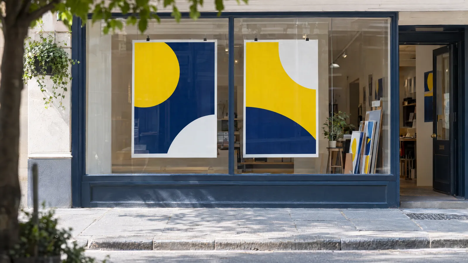
- Effective pairings: black on yellow, white on navy, black on white, white on red, yellow on black.
- Risky pairings: yellow on white, grey on black, red on green, blue on purple.
- Typeface: sans serif, heavy weight (bold or semibold), no decorative flourishes. Avoid thin weights and script fonts for body text.
- All caps work well for a 2–4 word headline, but longer text set in capitals is slower to read.
How much text on a poster? Information hierarchy
A poster isn't a flyer. Good practice is a headline of up to about 7 words, one supporting sentence and 3–4 short details. Every extra line either shrinks the lettering or cramps the layout, and both hurt legibility from a distance.
Arrange the text in a clear hierarchy, with each level noticeably smaller than the one above. When the headline and subheading are a similar size, the eye doesn't know where to start.
- Level 1 – headline: one idea, the largest element on the poster.
- Level 2 – supporting line: one sentence, about 1/2–1/3 the size of the headline.
- Level 3 – key details: date, venue, price, address, phone number or website.
- Level 4 – small print: logo, organisers, partners, QR code. These are read up close, so they can be small.
Poster layout: where to place the headline and image
Choose one entry point – the element the eye lands on first. This is usually the headline or main image in the top half or at eye level. From there, lead the eye in the natural reading direction, top to bottom and left to right, finishing on the key details.
Leave white space. Empty space around the headline acts like a frame and makes the text visible from further away. Keep important elements at least 5–10 mm from the edge (more for A1), as posters are often trimmed, framed or partly covered by tape.
You can check the design without printing it full size: viewing a 25% scale print from 1 m gives the same impression as viewing the poster at 1:1 from 4 m. You can also squint. Whatever you can still make out is your real hierarchy.
- Align all elements to a single grid or axis rather than scattering them freely.
- Limit yourself to 1–2 typefaces and 2–3 colours.
- The main image should take up a large part of the poster, rather than several small shots.
Event poster vs offer poster – what's the difference?
An event poster sells a date. The viewer needs to remember what's happening, where and when, so the date and venue are the second most important element after the name. An offer poster sells a benefit. The headline is what the customer gains, and the price or promotion often becomes the main graphic element.
| Feature | Event poster | Offer poster |
|---|---|---|
| Main message | Event name or performer | Benefit or price |
| Second most important element | Date, time, venue | Terms: until when, for whom, where |
| Call to action | Tickets, registration, free entry | Call, visit, order, QR code |
| Display period | Until the day of the event | Until the promotion ends, or permanently |
| Typical mistake | Date too small or tucked away at the bottom | A list of many services instead of a single offer |
Format, resolution and print-ready file
Choose the format to suit the viewing distance and location. A4 and A3 work on noticeboards and doors, while A2 and A1 suit shop windows and poster columns. Prepare the file at trim size with 3 mm bleed on each side, at 300 DPI at 1:1 scale. For A1 viewed from a few metres, 150 DPI is usually enough. The safest option is a PDF with text converted to outlines or fonts embedded. Indoor posters are most often printed on 150–200 g/m² coated paper; for shop windows, choose a matt finish, which reflects less light.
If you'd rather not keep an eye on bleed and margins yourself, at plakaty.shop (wielkareklama.eu studio) you fill in a short form and receive poster proposals as a PNG and a print-ready PDF with 3 mm bleed. A package with one proposal costs €12. Whoever designs your poster, read every word, phone number and address yourself before it goes to print.
| Format | Trim size | Size with 3 mm bleed | Typical reading distance | Headline capital height |
|---|---|---|---|---|
| A4 | 210 × 297 mm | 216 × 303 mm | 1–2 m | 10–20 mm |
| A3 | 297 × 420 mm | 303 × 426 mm | 2–3 m | 15–30 mm |
| A2 | 420 × 594 mm | 426 × 600 mm | 3–5 m | 25–45 mm |
| A1 | 594 × 841 mm | 600 × 847 mm | 5–8 m | 40–70 mm |
Checklist
- The poster conveys one idea that can be summed up in a single sentence.
- The headline is up to about 7 words, and its lettering suits the viewing distance.
- In greyscale, the design still has clear contrast between text and background.
- The date, venue, price or contact details are legible and not hidden in the small print.
- Important elements are at least 5–10 mm from the edge.
- The file has 3 mm bleed, 300 DPI (A1: min. 150 DPI) and fonts converted to outlines or embedded.
- You've checked a 25% scale print from 1 m away, or by squinting.
- You've read every word, phone number, address and date.
FAQs
How do I design a poster that's legible from a distance?
Limit it to one idea and one large headline, use a bold sans serif typeface and strong tonal contrast with the background. Match letter height to distance: about 5 mm of capital height for every metre. Leave plenty of white space around the headline and remove anything that isn't essential.
What font size should I use on an A3 poster?
An A3 poster is usually read from 2–3 m, so the headline should have a capital height of 15–30 mm, roughly 60–120 pt. Supporting information can be about 24–40 pt, and small details such as organisers 12–16 pt. Increase these sizes for thin typefaces.
How much text should an advertising poster have?
Ideally a headline of up to about 7 words, one supporting sentence and 3–4 short details such as the date, venue, price or contact. Move longer descriptions to a website or behind a QR code. The more text you add, the smaller the letters and the shorter the reading distance.
What resolution do I need to print a poster?
The standard is 300 DPI at 1:1 scale for A4 to A2. For A1 and larger posters viewed from a few metres, 150 DPI is usually enough. Add 3 mm bleed on each side and supply the file as a PDF.
Which colours are most visible on a poster?
Pairings with a big difference in lightness work best: black on yellow, white on navy, black on white or white on red. Avoid combinations of similar lightness, such as red on green or yellow on white. Check the design in greyscale, as that's roughly how the eye perceives it from a distance.
What paper should I print a poster on?
Indoor and shop-window posters are most often printed on 150–200 g/m² coated paper. A matt finish reflects less light behind glass, while gloss gives photos more vivid colours. Outdoors, where the poster is exposed to rain, dedicated outdoor papers or films are a better choice.