How to choose colours for advertising and branding: associations, contrast, 60-30-10 and print
Choose 2–3 brand colours and split them 60-30-10: 60% background, 30% supporting colour and 10% accent on the most important element. Put text on a background with a contrast ratio of at least 4.5:1 (WCAG), and in print keep it no smaller than 7–8 pt. Set up print artwork in CMYK at 300 DPI at 1:1 scale, with total ink coverage of up to about 300% on coated paper. Check the colours on a proof, because an RGB screen shows colours brighter and more saturated than paper can.
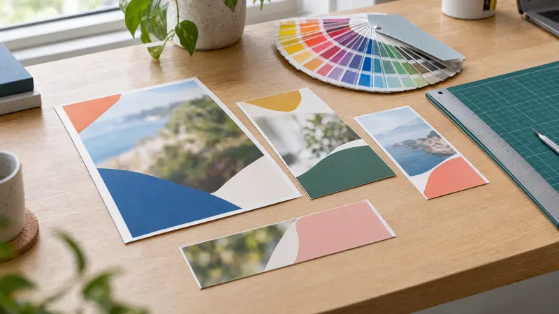
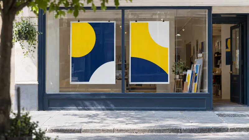
Colours in advertising decide whether anyone notices your poster, flyer or shop sign at all, and whether they have time to read what you are offering. You do not need theories about the “psychology of colour” for this. A handful of proven principles is enough: sensible use of sector associations, strong contrast, the 60-30-10 ratio, a consistent brand palette and an awareness that print never looks quite the same as a screen. Below you will find them in practical form, just as they are applied in a large-format print house.
What do colours suggest in different sectors?
Colour associations are cultural and industry conventions, not hard laws of psychology. Blue will not make a customer trust you, but in financial services it looks “right” because competitors have accustomed people to it. Treat the table below as a starting point, not a recipe.
What matters more than the colour itself is whether you stand out from the businesses around you. If every garage in your town has a red and black sign, navy with orange may be the better choice. The exact shade counts too: olive green says something very different from neon lime.
| Colour | Where it often appears | What to watch out for |
|---|---|---|
| Blue | finance, IT, healthcare, technical services, plumbing | extremely popular, so it is easy to get lost among competitors |
| Green | gardening, eco businesses, health food, pharmacy | bright on-screen greens lose saturation in CMYK |
| Red | food and drink, sales, motoring, sport | tiring in large amounts; in print it easily drifts towards pink or brick |
| Yellow and orange | construction, fast food, promotions, children’s products | yellow text on a white background is practically illegible |
| Black and gold | fashion, luxury, premium restaurants | gold in CMYK is only beige or brown; a genuine metallic sheen needs foil or a special ink |
| Pink and purple | cosmetics, beauty, cake shops, children’s products | CMYK print reproduces intense purples and pinks poorly |
Contrast and legibility: how much contrast does text need?
The safest benchmark is the WCAG standard: normal text needs a contrast ratio of at least 4.5:1 against its background, and large text (from about 18 pt, or 14 pt bold) at least 3:1. These values were devised for screens, but they work very well in print too, where glare, poor lighting and viewing on the move all come into play. You can check contrast with a free contrast calculator by entering the HEX codes of both colours.
In small-format print, do not go below 7–8 pt for body text, and make reversed-out text (light on a dark background) slightly larger and heavier, because ink tends to “fill in” fine strokes. On banners and roll-ups, legibility depends on viewing distance, so the simplest test is to print a section at 1:1 scale and look at it from the intended distance. Remember people with colour vision deficiency as well: never convey information by colour alone, for example red and green without an additional marker.
- Works well: dark navy or black on white, white on dark green, black on yellow.
- Works poorly: yellow on white, red on green, grey on grey, blue on black.
- Place text over a calm area of a photo or on a semi-transparent block of colour.
- Avoid thin typefaces at small sizes and when reversed out.
What is the 60-30-10 rule?
The 60-30-10 rule comes from interior design and brings order to the colours in any layout. Around 60% of the area is the dominant colour (usually the background or a neutral), 30% is the supporting colour (blocks, headings, illustrations), and 10% is the accent – the boldest colour, reserved for whatever should catch the eye: the price, the phone number, a button or an “order now” call to action.
It is a guideline ratio, not a rigid rule. A gig poster might be 80% strong colour, while a price list might be almost entirely white with a small accent. The key is to keep the accent scarce, because a colour used everywhere stops highlighting anything.
| Project | 60% (dominant) | 30% (supporting) | 10% (accent) |
|---|---|---|---|
| A5 flyer for a pizzeria | cream background | dark brown in headings and photos | red on the price and phone number |
| 85×200 cm roll-up for an IT company | white | navy in bands and the heading | lime on the website address |
| A4 café menu | dark green | beige in text and frames | copper tone beside the dishes of the day |
| 120 cm sign for a garage | graphite | white in the business name | orange on the phone number |
How do you build a brand colour palette?
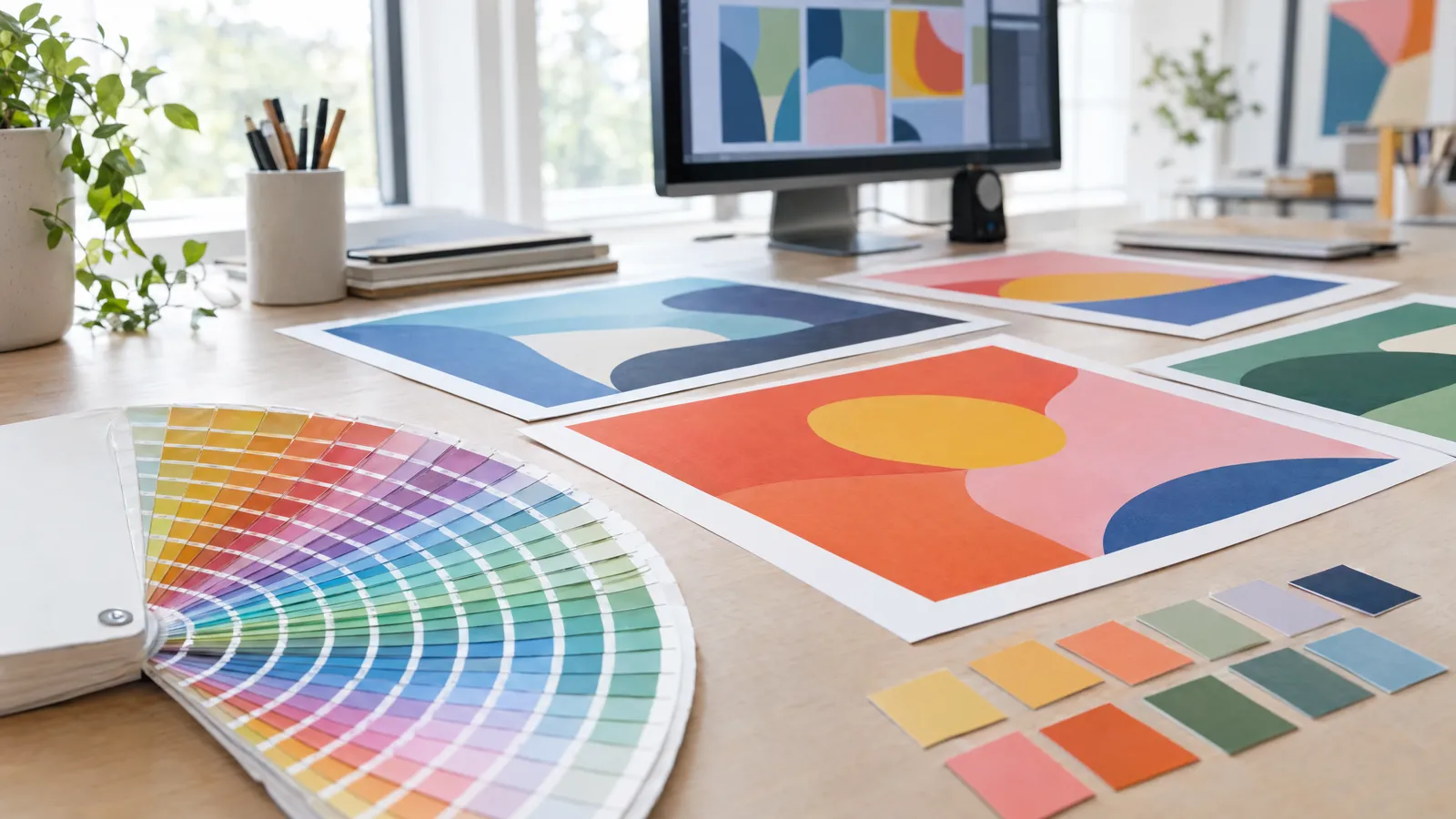
A brand palette usually consists of one main colour, one or two supporting colours, two neutrals (for example near-black and light grey) and possibly one accent. More colours make it harder to stay consistent across your business card, shop sign and social media posts. Record each colour in several notations, because the printer, the website and the sign maker all need different data.
Test the palette in practice before you sign it off: on white and on dark backgrounds, in small text and across large areas, on screen and in print. If you are ordering a design, for example from plakaty.shop (wielkareklama.eu studio), enter specific HEX codes in the form rather than just “blue”, and the proposals you receive will be much closer to your brand.
- HEX and RGB: website, social media, online banners.
- CMYK: digital and litho printing, large format.
- Pantone (PMS): spot colour printing, promotional items, clothing, if your brand requires it.
- RAL: shop signs, painted elements, walls and lightboxes.
- Also prepare a single-colour and a reversed version of your logo, in case of engraving or one-colour printing.
Colours in print versus on screen: why do they look different?
A screen emits light and mixes it using the RGB model, whereas paper only reflects light from beneath CMYK inks. The CMYK colour gamut is narrower, so neon greens, intense blues, purples and oranges look more muted once printed. A monitor set to maximum brightness raises expectations even further, so something that looks “just right” on screen can turn out too dark on paper.
Prepare print artwork in CMYK with the profile specified by your printer, most often one from the FOGRA family for coated or uncoated paper. Colour also depends on the substrate: the same file looks different on gloss art paper, uncoated offset paper, PVC banner material or self-adhesive vinyl. For important jobs, order a proof and judge it in daylight.
| Feature | Screen | |
|---|---|---|
| Colour model | CMYK (or Pantone spot colours) | RGB |
| Colour gamut | narrower, struggles with neons and purples | wider, colours brighter and more saturated |
| Resolution | 300 DPI at 1:1 scale for small formats; a banner viewed from a distance is usually 100–150 DPI at 1:1 scale | what matters is the pixel size, e.g. 1080×1080 px |
| Effect of the substrate | coated paper, uncoated paper, PVC and vinyl all shift the shade | depends on monitor calibration and brightness |
| White | the colour of the paper, not printed | a lit pixel |
Black, gold and large solids: what to watch for before printing
Set small text in pure black, 100% K, because black built from all four inks produces coloured fringes with even the slightest misregistration. Large black areas in K alone, on the other hand, look graphite grey, so a rich black is used instead, for example C40 M30 Y30 K100. Keep total ink coverage to about 300% on coated paper and lower on uncoated stock, in line with your printer’s guidelines.
Metallic and fluorescent colours do not exist in standard CMYK. If you want gold or neon, ask about foil or a special ink, or accept an imitation in the form of a gradient. Large flat areas of solid colour, especially greys and beiges, are the quickest to reveal differences between print runs, so for reprints give the printer the same file and the same material.
- Text up to about 12 pt: 100% K only.
- Large black area: rich black, not 100/100/100/100.
- Supply logo colours as exact CMYK values, not an automatic conversion.
- Extend elements that run to the edge into a 3 mm bleed so no white slivers remain after trimming.
Checklist
- The palette has no more than 3–4 colours plus neutrals, and the accent covers around 10% of the area
- Text-to-background contrast is at least 4.5:1, or 3:1 for large lettering
- Printed text is at least 7–8 pt, and reversed-out text is suitably heavier
- The print file is in CMYK with the profile specified by the printer
- Small text is in 100% K, and large black solids are in rich black
- Total ink coverage does not exceed the printer’s limit (usually about 300%)
- The artwork has a 3 mm bleed and a safety margin, and the resolution suits the format
- Brand colours match the recorded HEX, CMYK or Pantone codes
- You have personally read through all wording, phone numbers and addresses before printing
FAQs
Which colours work best in advertising?
There is no single best colour. High-contrast combinations that set you apart from competitors and suit the conventions of your sector work best. Proportion matters too: one bold accent against calm colours draws the eye more strongly than lots of bright colours at once.
How many colours should a brand palette have?
Usually one main colour, one or two supporting colours and two neutrals, such as dark graphite and light grey, are enough. A palette like this stays consistent easily on a business card, a shop sign and online. Add more colours only if the brand has several product lines that need distinguishing.
Why do printed colours look different from those on my monitor?
A monitor displays colours with light in RGB, whereas print uses CMYK inks with a narrower colour gamut. That is why neon and highly saturated colours look more muted in print, and a monitor set too bright makes the print seem darker. Preparing the file in CMYK with the correct profile and ordering a proof both help.
Should I give my printer colours in RGB or CMYK?
For print, supply CMYK, and for spot colour printing the Pantone number. Keep RGB and HEX for your website and social media. If you only have RGB, the printer will convert the file, but some shades may shift, so it is better to check the result of the conversion yourself.
What is the 60-30-10 rule in advertising?
It is a colour ratio for a design: around 60% is the dominant colour, 30% the supporting colour and 10% the accent on the key elements, such as the price or phone number. It helps avoid visual chaos and guides the eye where you want it. Treat it as a guideline that you can adjust to suit the character of the project.
What colour contrast will make a poster or banner legible?
A good benchmark is a contrast ratio of at least 4.5:1 for normal text and 3:1 for large lettering, measured with a contrast calculator using HEX codes. Dark text on a light background, or the reverse, is the most reliable choice, without coloured backgrounds of similar brightness. For banners, also check a section printed at 1:1 scale from the distance at which passers-by will see it.