Advertising for Estate Agents, Property Developers and Renovation Firms: Flyers, Posters and Graphics – Ideas and Examples
In property and renovation, the most effective materials are the ones people see on site. A fence banner (e.g. 300×100 cm, 440–510 g/m² PVC, artwork at 72–100 DPI at 1:1 scale) works well alongside a 60–100 cm wide ‘For Sale’ board and an A5 or DL flyer on 130–170 g/m² coated paper, delivered locally. Add an 85×55 mm business card on 350 g/m² board, an 85×200 cm roll-up for property shows and 1080×1080 px social posts. Prepare small-format files at 300 DPI with 3 mm bleed. Make the phone number on a banner large enough to read from the street, usually at least 8–10 cm high.
Example designs for this industry
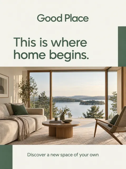
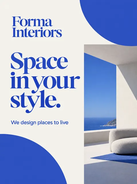






Property and renovation work is sold locally. The customer lives a few streets away, walks past the building site or spots the team’s van outside the next block of flats. That is why print still matters so much in this sector, with social media graphics as a complement rather than a replacement. Below you’ll find which materials to choose, 10 proven ideas, ready-made slogans, colour choices, a seasonal calendar and the mistakes that most often waste the budgets of estate agents, developers, renovation firms and interior designers.
Which advertising materials matter most in the property sector?
The most important are the formats that work on site and in the surrounding area: the banner, the board and the flyer. These reach people who are already interested in a particular development or are planning renovation work nearby. A business card and a property details sheet seal the contact at a meeting, while social media graphics keep interest alive in between.
The right mix depends on the type of business. A developer or renovation firm has the site hoarding or fence, which is free advertising space. An estate agency lives on boards and letterbox flyers. An interior designer lives on their portfolio, so attractive photography on posters, brochures and posts matters more.
| Material | Typical size | Most important for | Print specification |
|---|---|---|---|
| Fence banner | 200×100, 300×100, 500×100 cm | developer, renovation firm | frontlit PVC or mesh, PDF at 1:10, 72–100 DPI at 1:1 scale |
| Board / sign | 60–120 cm wide | estate agency, developer | PVC foam board or Dibond, vector artwork |
| Flyer | A5 (148×210 mm), DL (99×210 mm) | estate agency, renovation firm | 130–170 g/m² coated paper, 300 DPI, 3 mm bleed |
| Business card | 85×55 or 90×50 mm | everyone | 350 g/m² board, 300 DPI, 3 mm bleed |
| Poster / property details sheet | A4–A1 | sales office, interior designer | 150–300 DPI depending on size |
| Roll-up | 85×200 or 100×200 cm | developer, interior designer at shows | PDF at 1:10, key content above approx. 80 cm |
| Post and Stories | 1080×1080 and 1080×1920 px | everyone | RGB, text kept away from the edges |
10 advertising ideas for estate agents, developers and renovation firms
Each of these ideas can be done on a modest budget. It works best to combine 2–3 formats with one slogan and one look, so customers recognise the business the second time they see it.
- Building site fence banner: hang a 300×100 cm banner with eyelets roughly every 50 cm, showing the company name, one service and a large phone number. In an exposed, windy spot, choose mesh, which lets the air through.
- ‘For Sale / To Let’ board: for an estate agency, use a 60–100 cm board with the phone number as the largest element and a smaller logo. One design for every listing builds recognition around town.
- Local letterbox flyer: the agency delivers an A5 flyer offering a free valuation on a specific estate. Only use a ‘we’re looking for a home for a client’ message when that client genuinely exists.
- ‘Before and after’ flyer for a renovation firm: a double-sided DL with two photos of the same bathroom before and after on the front, and the range of services plus phone number on the back. Only use your own completed projects.
- Business card with a QR code: 85×55 mm with a code linking to your portfolio or listings. Print the code at a minimum of about 2×2 cm and test it with a phone before going to print.
- Roll-up for property shows and the sales office: 85×200 cm with a visualisation of the development at the top and the development name at eye level. Leave the bottom 30 cm or so as background, as people and tables will hide it.
- Van graphics: a renovation firm puts its name, service and phone number on the sides and rear. A van parked outside a block of flats for a week-long job is the cheapest advertising in the neighbourhood.
- Property details sheet and window poster: an A4 sheet with the floor plan, floor area, floor level and price, plus A2 or A1 posters of the best listings in the agency window. Replace them as soon as a property sells.
- Consultation voucher: an interior designer or renovation firm hands out a DL voucher for a free quote or on-site consultation. It works well as an extra with homes sold through a partner developer or agency.
- A series of posts and Stories: 1080×1080 px for the listing or project of the week and 1080×1920 px for a short ‘walk-through’ of a property. Keep the same layout, colours and logo position in every graphic.
What should you put on a flyer, banner or poster? Sample slogans
A good flyer in this sector has five elements: a headline with a clear benefit, 3–5 short points, proof (a project photo, visualisation or floor plan), a call to action with a phone number, and the area you cover. On a banner, keep only the headline, one piece of information and the phone number, because a driver has just a few seconds to read it.
Avoid vague claims such as ‘professional and reliable’. Specifics, such as how quickly you quote, the scope of work or the number of bedrooms, are more persuasive than adjectives.
- Estate agency: ‘Selling a home on this estate? Free valuation at your property’
- Estate agency: ‘We sell, we let, we handle the paperwork. Call: …’
- Developer: ‘2–4 bedroom homes with gardens. Sales office on site’
- Developer: ‘View the show home – book by phone’
- Renovation firm: ‘Complete bathroom renovations. Quote after a site visit, completion date in the contract’
- Renovation firm: ‘Renovating in your area. We clean up after ourselves’
- Interior designer: ‘Interior design tailored to your budget’
- Interior designer: ‘On-site consultation – see what can change without knocking down walls’
Which colours and styles suit the property sector?
Colours depend on what you’re selling: trust, a dream home or a fast service. Estate agents and developers go for calm and quality, renovation firms for visibility from a distance, and interior designers for a background that doesn’t compete with the interior photos.
Whatever the style, save your brand colours in CMYK for print and RGB for online graphics, as vivid on-screen shades usually print darker. Property photos must be bright, straightened and high resolution, because the photos sell the home, not the decoration.
| Type of business | Colours | Style and typography |
|---|---|---|
| Estate agency | navy, graphite, white, gold or copper accent | understated, simple sans-serif typeface, large phone number |
| Developer | greens, beiges, graphite, colours from the visualisations | premium, plenty of white space, visualisation as the main element |
| Renovation firm | orange or yellow with graphite, or possibly red | high contrast, bold lettering legible from a distance |
| Interior designer | white, greys, natural beiges, black | minimalist, full-width photos, elegant typeface |
Seasonal calendar: when to advertise property and renovation services
The market has its own rhythm, driven by the building season, the academic year and the holidays. Prepare materials at least several weeks in advance, as printing and installing banners also takes time.
| Period | Occasion | What to prepare |
|---|---|---|
| January–February | planning spring renovations | quote flyers, project posts, consultation vouchers |
| March–April | start of the building season | new fence banners, van graphics, exteriors and gardens |
| May–June | property shows, development open days | roll-ups, posters, invitations, property details sheets |
| July–August | renovations while occupants are away, lettings ahead of the academic year | flyers for landlords and homeowners, Stories with rental listings |
| September–October | academic year, autumn shows, work before winter | rental listings, banners about insulation and windows |
| November–December | year end, Christmas | Christmas cards for clients and partners, a round-up of completed projects |
How to prepare files so your print comes out well
Prepare small formats (business cards, flyers, property details sheets) at 300 DPI, at the trimmed size plus 3 mm bleed on each side, with a safety margin of about 3–5 mm for text. Large-format printers usually accept PDFs at 1:10 scale, and a resolution of 72–150 DPI at 1:1 scale is enough, as a banner is viewed from several metres away.
If you don’t have a designer, you can order a flyer, banner or roll-up design from plakaty.shop (wielkareklama.eu studio): fill in a short form and within minutes you’ll receive design options, from €12 each, with a PDF file with bleed, or at 1:10 scale for large formats. Always proofread the wording, phone numbers and addresses yourself before sending anything to print.
Common mistakes in property and renovation advertising
Most unsuccessful adverts in this sector share the same problem: too much information on a format that people look at for a few seconds. The second group of mistakes is poor photography and a lack of specifics.
- A banner with paragraphs of text and a phone number too small to read from the road.
- Stock photos instead of your own projects – renovation customers quickly sense it.
- Dark, crooked or blurry property photos and low-resolution visualisations.
- No 3 mm bleed, leaving a white edge once the flyer is trimmed.
- Out-of-date prices and listings on window posters or boards.
- A QR code that leads to a dead page or is too small for a phone to scan.
- Unsubstantiated ‘cheapest’ or ‘best’ claims and promised completion dates you won’t meet.
- No service area – the customer doesn’t know whether the team will travel to their town.
Checklist
- Phone number, address and company name proofread and checked by hand
- The phone number is the largest element on the banner and board
- Small-format files at 300 DPI with 3 mm bleed
- Large formats supplied as a PDF at 1:10 scale at the agreed size
- Photos of your own projects or high-resolution visualisations
- QR code scanned with a phone and leading to a working page
- Prices, floor areas and availability up to date on the day of printing
- Service area and a clear call to action shown on the flyer
- Permission from the fence owner or developer to hang the banner
FAQs
How should an estate agency advertise locally?
Focus on consistent ‘For Sale’ boards with a large phone number, A5 free-valuation flyers delivered to selected estates and listing posters in the window. Add 1080×1080 px posts featuring a listing of the week. A consistent look across all materials means people start to associate your agency with the area.
What size banner should I choose for a building site fence?
300×100 cm is the most popular choice, while longer fences suit 500×100 cm or several banners side by side. On a fence in an exposed, windy spot, mesh is better than solid PVC. Limit the content to the company name, one service or the development name, and the phone number.
What should a renovation firm put on its flyer?
Start with a specific service and benefit, e.g. ‘Complete bathroom renovations’, then add 3–5 points about the scope of work, before-and-after photos and your phone number. Say which towns you cover and how quoting works. A DL or A5 format is quite sufficient.
What paper weight should I choose for flyers and business cards?
Flyers are usually printed on 130–170 g/m² coated paper, with heavier stock working better for flyers handed out in person. Business cards are typically printed on 350 g/m² board. Matt coated paper suits the understated style of interior designers and estate agents, while gloss makes interior photos more vivid.
Which colours work best for property advertising?
Estate agents most often choose navy, graphite and white with a warm accent, and developers greens and beiges that match their visualisations. Renovation firms benefit from contrast, such as orange with graphite, which stands out from a distance. Interior designers should opt for a neutral background that shows off their project photos.