The 10 Most Common Mistakes in Print Files and How to Avoid Them
The most common mistakes in print files are missing 3 mm bleed, colours left in RGB instead of CMYK, images below 300 DPI at 1:1 scale, text closer than 3–5 mm to the trim line, lines thinner than 0.25 pt, fonts that are neither embedded nor outlined, the wrong document size, typos, badly defined black and borders placed right at the edge. You can avoid them by saving your design as a PDF at the trim size plus bleed, in CMYK, with fonts embedded or converted to outlines, and by setting small text in pure black 0/0/0/100. Before sending, always read every line of text, phone number and address yourself.
A printer prints exactly what is in the file. If a design comes back with clipped letters, grey text where it should be black, or a blurry photo, the problem almost always lies in how the file was prepared, not in the press. Below are the 10 mistakes we see most often in customers' files, what they do to the finished print, and practical ways to fix them before you pay for the whole run.
What are the most common mistakes in print files?
Most problems crop up again and again, whether you are printing business cards, flyers or a fence banner. The table brings all ten mistakes together in one place, and the sections that follow give you the details and the exact figures.
| Mistake | Effect on the print | Solution |
|---|---|---|
| 1. No bleed | White slivers along the edges after trimming | Extend the background 3 mm on every side |
| 2. RGB colours | Dull, shifted colours | Convert to CMYK before exporting |
| 3. Low resolution | Blurry, jagged photos | 300 DPI at 1:1 scale for small formats |
| 4. Text near the edge | Letters or numbers cut off | Safe margin of 3–5 mm |
| 5. Thin lines | Lines disappear or break up | Minimum 0.25 pt, ideally 0.3–0.5 pt |
| 6. Missing fonts | Substituted typeface, text reflowing | Embed fonts or convert to outlines |
| 7. Wrong size | Stretched or cropped design | Trim size + bleed, correct format proportions |
| 8. Typos | Wrong phone number, address or name | Proofread a printed copy, ask a second person |
| 9. Wrong black | Grey text or smudged lettering | Text in 0/0/0/100, large areas in rich black |
| 10. Borders near the edge | Border uneven from side to side | Move the border inwards or drop it |
Bleed, text near the edge and borders – why is the edge the danger zone?
Sheets are trimmed on a guillotine or a cutting plotter, and every cut has a tolerance ranging from a fraction of a millimetre to around 1 mm. That is why anything touching the edge, or sitting right next to it, is at risk. Three of the mistakes on the list share this one cause.
The standard bleed for flyers, business cards and posters is 3 mm. For large formats (banners, mesh, roll-ups) printers often ask for a bigger allowance or supply their own template, because of welded hems, fold-overs or the part hidden inside the cassette, so always check the specification of the printer you are using.
- Mistake 1 – no bleed: extend any background, photo or colour band that should run to the edge 3 mm beyond the trim size. Simply enlarging the document without stretching the artwork achieves nothing.
- Mistake 4 – text near the edge: keep text, logos and phone numbers at least 3 mm from the trim line, and ideally 4–5 mm on business cards and flyers. On an eyeleted banner, leave a clear strip of a few centimetres around the border.
- Mistake 10 – borders near the edge: a thin border 2–3 mm from the edge will come out wider on one side and narrower on the other after trimming. Move it at least 5 mm inwards, make it very wide and extend it into the bleed, or leave it out altogether.
RGB or CMYK, and how should you set up black?
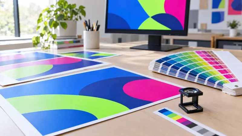
Your monitor displays colour in RGB, whereas the press prints with CMYK inks, which have a smaller colour range. The bright greens, turquoises, neon pinks and saturated blues you see on screen lose much of their punch after conversion. If you leave the conversion to the printer, you have no control over the result, so do it yourself and check the colours before sending the file (mistake 2).
Mistake 9 concerns black. Black text from office software or RGB (0,0,0) turns into a mix of all four inks with a total coverage of close to 400%, which gives small text fuzzy edges and coloured halos, and causes drying problems on large solid areas. On the other hand, 100% K on its own looks dark grey on a large background.
- Small text, fine lines, barcodes: 0/0/0/100 only.
- Large black backgrounds and bold headings: rich black, e.g. C60 M40 Y40 K100.
- Keep total ink coverage typically within 280–330% – the exact limit depends on the paper and the printing process, so check it with your printer.
| Element | Recommended black | Why |
|---|---|---|
| Text below approx. 12 pt | C0 M0 Y0 K100 | No ink registration problems |
| Large background, poster, banner | C60 M40 Y40 K100 | Deep, saturated black |
| Black from RGB 0,0,0 | Avoid | Too much ink, smudging |
How many DPI do you need for print?
Always work out resolution at the actual printed size. A photo 1000 px wide is only 300 DPI at around 8.5 cm; stretched across an A4 sheet it drops to around 120 DPI and looks blurry (mistake 3). Your software will show you the value at 1:1 scale, and artificially raising the DPI in the settings does not add any detail.
The resolution you need depends on viewing distance. A business card is read from a few centimetres away, a fence banner from several metres, which is why large formats can get away with a lower DPI. If the design is built at 1:10 scale, the resolution in the file must be ten times higher than the target.
| Product | Viewing distance | Resolution at 1:1 scale |
|---|---|---|
| Business card, flyer, label | Hand-held | 300 DPI |
| Poster A3–A1 | 0.5–2 m | 150–300 DPI |
| Roll-up | 1–3 m | 100–150 DPI |
| Fence banner, mesh | Several metres | 72–100 DPI |
Thin lines and missing fonts – mistakes you can't see on screen
Zoomed in on a monitor, every line looks fine, but a hairline or a 0.1 pt stroke may vanish or break up in print (mistake 5). The safe minimum is 0.25 pt for a dark line on a light background, and 0.3–0.5 pt is better. Make reversed-out lines and text, i.e. light on a dark background, heavier, as the ink tends to fill them in slightly.
Mistake 6 is missing fonts. If the printer doesn't have your typeface, the software will substitute another, and the text may reflow, break across lines differently or lose accented characters. When exporting to PDF, embed all fonts or convert the text to outlines.
- Smallest text on flyers and business cards: usually 6–7 pt, and 1–2 pt more when reversed out.
- Avoid thin serif typefaces and very light weights for small text.
- Export to PDF using the standard your printer specifies, e.g. PDF/X-1a or PDF/X-4.
- After exporting, open the PDF and check that all accented and special characters are in place.
Wrong size – trim size, bleed size and 1:10 scale
Mistake 7 happens when the design has different proportions from the format ordered, e.g. a flyer designed as a square to be printed on A5. The printer then has to crop part of the artwork or leave empty margins. Set up your document at the trim size, i.e. the finished size after cutting, from the outset, and add bleed to get the full bleed size.
Large formats such as roll-ups and banners are usually prepared as a PDF at 1:10 scale, so an 85×200 cm roll-up becomes an 85×200 mm document. Bleed, margins and resolution are then calculated at the same scale, in line with the printer's requirements.
| Format | Trim size | Size with 3 mm bleed |
|---|---|---|
| Business card (UK/Ireland) | 85×55 mm | 91×61 mm |
| Business card (continental Europe) | 90×50 mm | 96×56 mm |
| A6 flyer | 105×148 mm | 111×154 mm |
| DL flyer | 99×210 mm | 105×216 mm |
| A5 flyer | 148×210 mm | 154×216 mm |
| A4 poster | 210×297 mm | 216×303 mm |
| A3 poster | 297×420 mm | 303×426 mm |
Typos – how do you check your text properly before printing?
A typo is the most expensive mistake of all, because it cannot be fixed once the run is printed (mistake 8). The most damaging are errors in phone numbers, email addresses, websites, prices and opening hours, because customers simply won't be able to reach you. A spellchecker won't catch a transposed digit or a wrong postcode.
Even if you use ready-made tools – at plakaty.shop, for example, designs are automatically checked for correct wording – you still have to do the final proofread yourself, because only you know what your phone number and address are.
- Print the design on an ordinary desktop printer at 100% scale and read it from the paper, not the screen.
- Read it aloud, slowly, taking each digit of your phone number and VAT or company number separately.
- Ring the number given and type the website address into a browser.
- Ask someone who doesn't know the content to read the text.
Checklist
- Backgrounds and graphics extend 3 mm beyond the format (bleed)
- Text and logos sit at least 3–5 mm from the trim line
- The file is in CMYK and the colours have been checked after conversion
- Photos are 300 DPI at 1:1 scale (correspondingly less for large formats)
- Small text is in 0/0/0/100 black and lines are at least 0.25 pt
- Fonts are embedded in the PDF or converted to outlines
- The document size matches the trim size ordered plus bleed
- Borders are at least 5 mm from the edge or have been removed
- Phone numbers, addresses and prices have been read personally on a printed proof
FAQs
How many millimetres of bleed does a print file need?
For flyers, business cards, posters and greetings cards the standard is 3 mm on every side. For banners, roll-ups and other large formats, printers may ask for a larger allowance or supply their own template. Always check the specification of the printer you are ordering from.
Can I send a file to the printer in RGB?
Many printers will accept an RGB file and convert it automatically, but then you have no control over how the colours change. Saturated greens, turquoises and pinks usually lose much of their vibrancy. It is safer to convert the design to CMYK yourself and check the result before sending it.
What resolution do I need to print a poster?
For A3–A1 posters viewed close up, 150–300 DPI at the actual printed size is sufficient. The greater the viewing distance, the lower the resolution can be; a fence banner, for example, is usually printed at 72–100 DPI. What counts is always the DPI at 1:1 scale, not the figure entered in the file settings.
Why did my black text come out grey or blurry?
Grey text is often black defined as, say, 80% K, or RGB black that has been badly converted. Blurry edges appear when small text is made up of four inks that shift very slightly out of register. Set small text as C0 M0 Y0 K100.
What does converting text to outlines mean?
It turns the letters into vector shapes, so the file no longer needs the font installed and looks the same everywhere. Once converted, the text can no longer be edited, so keep a copy of the editable version. The alternative is to embed the fonts when exporting to PDF.
What is a safe margin from the edge on a business card?
Keep text and logos at least 3 mm from the trim line, and ideally 4–5 mm. On a standard 85×55 mm business card this gives a safe area of around 75×45 mm. It is best to avoid borders right at the edge, as the cutting tolerance will make them uneven.