How Big Should Letters Be on a Banner or Shop Sign? Readability from a Distance
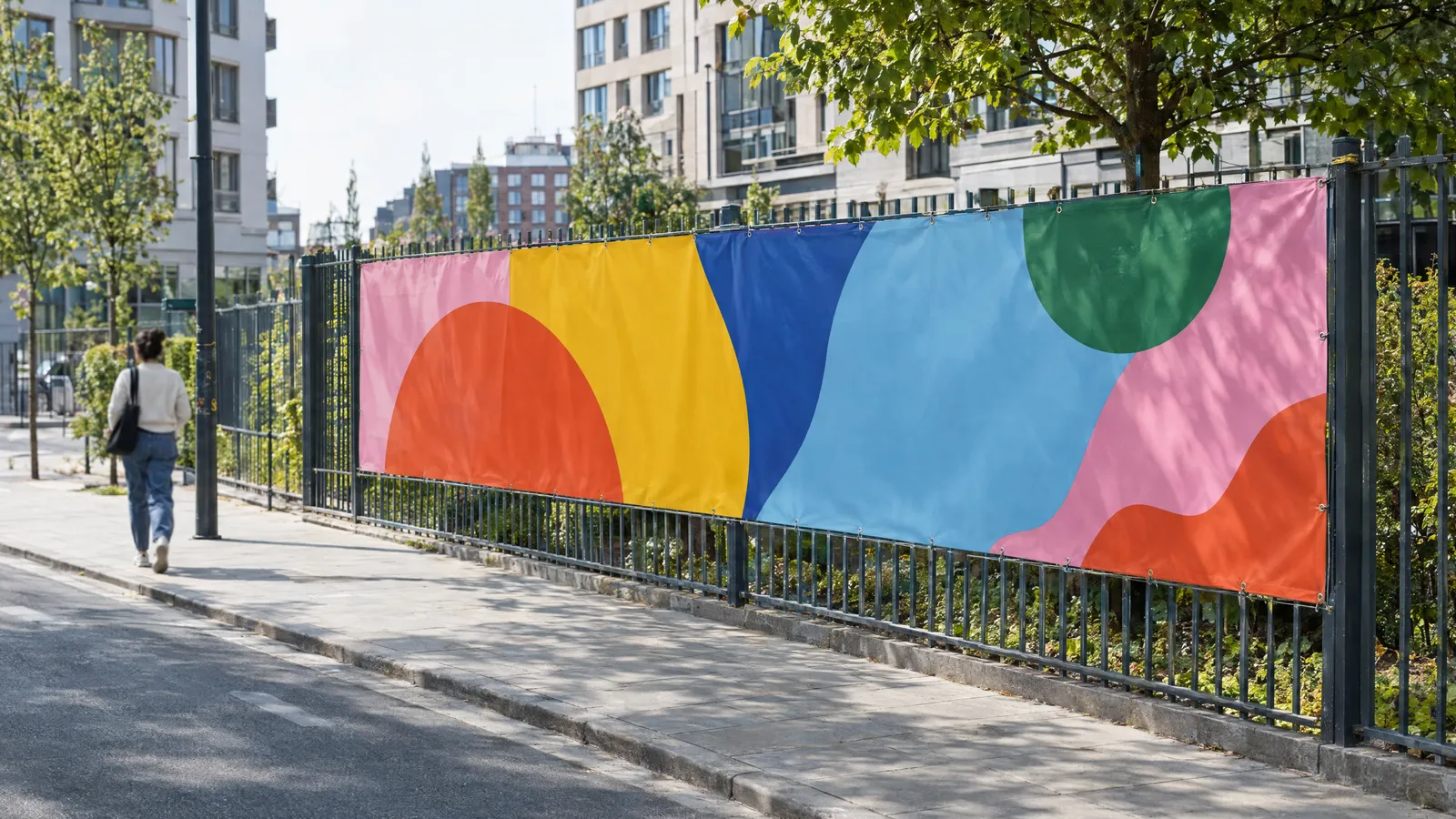
As a rule of thumb, allow about 1 cm of capital letter height for every metre of distance from which the text needs to be read at a glance (e.g. 10 cm from 10 m). The absolute minimum is about 3 mm per metre (3 cm from 10 m), but only with strong contrast and a bold sans-serif typeface. On a roadside banner read from 20–30 m, the headline should be about 20–30 cm high and the phone number at least 10–15 cm.
A banner on a fence or a sign above a shopfront usually has just a few seconds to be read. If the letters are too small, too thin or lost against the background, even the best headline won't work. Below you'll find a rule of thumb for letter height relative to viewing distance, a quick-reference chart, and guidance on contrast, typeface, word count and fascia signs above the door. It's the same know-how that large-format print shops apply to every outdoor advertising job.
What is the rule: letter height versus viewing distance?
Outdoor advertising works to a simple rule of thumb: roughly 1 cm of capital letter height for every metre of distance gives quick, effortless reading. The lower limit is about 3 mm per metre – at that distance the text can still be read, but the viewer has to look carefully, and that needs ideal conditions.
This is a guideline, not a standard. The result depends on the typeface, stroke weight, contrast, lighting, viewing angle and whether the viewer is standing, walking or driving past. The poorer the conditions, the closer you should stay to the upper value.
- Pedestrians who can stop and look: a middle value of around 5–7 mm per metre is enough.
- Drivers, or anyone passing the advert on the move: stick to about 1 cm per metre or more.
- Secondary text (opening hours, small print): can sit closer to the minimum, as it's read by people who have already walked up.
Chart: viewing distance → letter height
The chart shows capital letter height (cap height) calculated using the rule of thumb. The "minimum" column is the limit of legibility with good contrast and a heavy typeface; the "recommended" column is the size for reading at a glance, e.g. from a passing car.
| Viewing distance | Minimum (approx. 3 mm/m) | Recommended (approx. 1 cm/m) | Typical use |
|---|---|---|---|
| 1 m | 3 mm | 1 cm | Price list in a shop window, door plaque |
| 3 m | 1 cm | 3 cm | Roll-up banner on a stand, poster indoors |
| 5 m | 1.5 cm | 5 cm | Fascia sign above the entrance read from the pavement |
| 10 m | 3 cm | 10 cm | Sign read from across the street, banner on a fence |
| 20 m | 6 cm | 20 cm | Banner on a residential street |
| 30 m | 9 cm | 30 cm | Roadside banner, scaffolding mesh |
| 50 m | 15 cm | 50 cm | Large banner beside a dual carriageway |
Which height do you measure: capitals, lower case or numerals?
The rule applies to the height of a capital letter, such as "H" or "E". If you set text in lower case, what matters is the height of the letters without ascenders and descenders (the x-height, i.e. the height of a letter "x"), which in most typefaces is about 2/3 of the cap height. That's why lower-case text needs a correspondingly larger type size in your software.
Be careful with type size in points: the same value in different typefaces produces different physical letter heights. Always measure the finished letter in millimetres or centimetres rather than trusting the number in the software's size box. Treat the digits in a phone number as capitals – they must meet the same rule, because after the name, the number is the most-read piece of information.
Colour contrast – more important than size alone
Even large letters stop being legible when the text colour is close in lightness to the background. What matters most is the difference in lightness, not in hue. A simple test: convert the design to greyscale – if the text merges with the background, the contrast is too weak.
Text placed over a photo almost always loses legibility from a distance. If you have to use a photo, put the text on a solid block of colour, or darken or lighten the area of background behind it. Where contrast is weaker, use larger, heavier letters.
- Good combinations: black on yellow, black on white, white on navy or dark green, yellow on black, white on red.
- Poor combinations: red on green, blue on black, yellow on white, grey on grey, pastels on pastels.
- Outdoors, glossy material can reflect the sun – for banners and signs in full sunlight, a matt finish works better.
Which typeface should you choose for a banner or sign?
From a distance, the easiest typefaces to read are simple sans-serifs with open letterforms in a medium or bold weight (medium, semibold, bold). Very thin strokes disappear after just a few metres, while very heavy weights (black) fill in the counters, e.g. in "e" or "a".
Capitals work well for short headlines and one- or two-word names. Longer sentences are easier to read in sentence case – a capital at the start and lower case after – because words then keep their distinctive shape. Slightly increased letter spacing improves legibility from a distance, especially in all-caps text.
- Avoid script, decorative and heavily condensed typefaces for the main message.
- Don't combine more than two typefaces on one banner.
- Don't stretch or squash letters horizontally to make text fit – change the wording or layout instead.
- You can keep a decorative typeface in the logo, provided there's a legible name or headline alongside it.
How many words fit on a banner?
Drivers and passers-by usually have a few seconds to take in the message. In outdoor advertising, the rule of thumb is that the main message shouldn't exceed about 7 words. Every extra word on the same area either shrinks the letters or overloads the design.
Build a clear hierarchy: one piece of information dominates, and everything else is noticeably smaller. On a 300×100 cm banner read from about 20 m, the headline can be around 20–25 cm high, and the phone number or website about 10–12 cm. Leave clear space around the text, too – white space improves legibility more than an extra graphic element.
- 1. What you offer, or the headline (largest).
- 2. Company name or logo.
- 3. One way to get in touch: phone number or website.
- 4. Optionally, an arrow or a short directional note ("200 m on the right").
Fascia sign above the entrance – how to size the letters
A shop sign is usually read from the pavement (3–5 m), from across the street (10–20 m) and from a moving car. Size the letters of the name for the greatest realistic distance from which customers should spot the premises – in practice, most often 10–20 m, i.e. about 10–20 cm of cap height. On a 120 cm wide sign, that leaves room for a short name and one supporting line, such as the type of business.
Mounting height matters too. A sign hung high overhead and viewed from close by is seen at a steep angle, which visually shortens the letters – so check legibility from where customers actually stand. The lettering shouldn't fill the whole panel: leave a margin from the edges so the text doesn't look cramped and isn't obscured by the fixings.
- Name: the largest element, legible from across the street.
- Type of business or tagline: about half the height of the name.
- Opening hours and phone number: ideally on the door or in the window, at eye level.
- If the premises open after dark, plan lighting for the sign – even large letters are unreadable at night without it.
How to check legibility before printing
The simplest method is to view the design to scale. View a 1:10 scale design from 1/10 of the target distance: for a banner meant to be read from 20 m, print or display it at 1:10 and look at it from 2 m. If you have to strain to read it, no one on the street will read it either.
Large-format files at 1:10 scale are standard practice in large-format print shops – plakaty.shop (wielkareklama.eu studio) prepares banner and roll-up files this way too, which makes this test easy. For signs, it's also worth printing the section with the name at 1:1 across several sheets and sticking it up where the sign will be fitted.
Checklist
- Main letters are about 1 cm high for every metre of viewing distance
- No important text falls below about 3 mm per metre
- In greyscale, the design still shows clear contrast between text and background
- The typeface is sans-serif, medium or bold, with no thin strokes
- The main message is no more than about 7 words
- The phone number or website is legible from the target distance
- Text has a margin from the edges and fixing points (eyelets, frames)
- Design viewed at 1:10 scale from 1/10 of the target distance
- All text, phone numbers and addresses personally proofread before printing
FAQs
How big should letters be on a banner seen from 10 metres?
For reading at a glance, allow about 10 cm of capital letter height. The minimum is about 3 cm, but only with strong contrast, a heavy typeface and good light. Secondary information can be smaller, provided it doesn't fall below that minimum.
What is the best font for a banner?
Simple sans-serif typefaces in medium, semibold or bold weights work best. Avoid script, decorative, very thin and heavily condensed typefaces. Don't mix more than two typefaces in one design.
Which colours are most legible from a distance?
The most legible combinations have a big difference in lightness, e.g. black on yellow, black on white, white on navy or yellow on black. Pairs of similar lightness, such as red on green or blue on black, work poorly. Check the design in greyscale – if the text disappears, the contrast is too weak.
How much text can go on a 3×1 m banner?
As a guide, a main message of up to about 7 words, plus the company name and one contact detail. Read from about 20 m, the headline should be around 20–25 cm high and the phone number about 10–12 cm, so more content simply won't fit at a legible size.
How big should the letters be on a shop sign?
Size them for the greatest distance from which customers should spot the premises, usually 10–20 m, which means about 10–20 cm for the letters of the name. The type of business or tagline can be about half that height. Check the viewing angle too, as a sign mounted high and seen from close by is harder to read.
Are capital letters more legible than lower case?
Capitals work well for short one- or two-word text. Longer headlines are easier to read in sentence case, with a capital only at the start. Remember that lower-case letters are shorter, so at the same type size you'll need to set them larger.