Black in Print: Rich Black and Black Text
Print small text (below about 12 pt), fine lines and barcodes in black only, 0/0/0/100 (100K). With four inks, even the slightest misregistration creates coloured fringes and fuzzy letters. Use rich black, such as C60 M40 Y40 K100 (240% in total), for large backgrounds and headings from about 24 pt. Keep within the ink coverage limit, which is usually 300–330% on coated stock and 260–300% on uncoated. Never use 100/100/100/100 black (400%). The ink won't dry, it sets off onto other sheets and it cracks along folds.
Black looks like the simplest colour in any design, yet in print it causes more trouble than any other. The same ‘black’ background can come out deep and inky or washed-out grey. Small text can be razor-sharp or surrounded by a pinkish halo. It all depends on which inks you use to build black in your file. This guide explains when 100K is enough and when you need rich black. It also covers how to stay within the ink coverage limit and how to prepare a large black background on a poster or banner.
100K black vs rich black: what's the difference?
In CMYK printing, 100K black is black ink alone (C0 M0 Y0 K100). It's crisp and easy to print, but across a large area it looks like a very dark grey, because a single layer of black ink doesn't fully cover the paper. Rich black is K100 with added cyan, magenta and yellow. The extra inks deepen the black and give a velvety, saturated solid.
The CMY additions also set the tone of the black. More cyan gives a cool black, while more magenta and yellow give a warm one. The values below are typical examples, not a standard. Printers may have their own recommendations tailored to their presses and paper.
| Type of black | CMYK | Total ink | Use |
|---|---|---|---|
| 100K black | 0/0/0/100 | 100% | Text, fine lines, barcodes and QR codes, small icons |
| Neutral rich black | 60/40/40/100 | 240% | Large backgrounds, large headings, black areas on posters and business cards |
| Cool rich black | 60/40/20/100 | 220% | Backgrounds in tech-style designs with a cool colour palette |
| Warm rich black | 30/50/50/100 | 230% | Backgrounds in elegant designs featuring browns, gold or red |
| Registration black | 100/100/100/100 | 400% | Crop marks and registration marks only, never in the design |
| Black from RGB 0/0/0 after conversion | approx. 75/68/67/90 | approx. 300% | Avoid in text, as it is created accidentally during conversion |
Why should small text be 100K?
In offset printing, each ink is applied separately from its own plate. Even a tiny shift between them (a registration error of a few tenths of a millimetre) gives a four-colour letter coloured edges. It then looks blurred and becomes harder to read. With 100K text the problem doesn't arise, because each letter is made from a single ink.
The second advantage is overprinting. 100K black is normally overprinted onto the background, so the background doesn't need to be knocked out under the letters. As a result, no white gaps appear if the inks shift. Most RIP systems set 100K to overprint automatically, but it's worth checking in the output preview. In inkjet digital printing registration is more accurate, but 100K text still prints the cleanest.
- Body text and footnotes below about 12 pt: always 100K.
- Fine lines, borders and table rules below about 1 pt: 100K.
- Barcodes and QR codes: 100K, because scanners struggle with blurred edges.
- Small icons, phone numbers, addresses and footer details: 100K.
- Only use rich black for text from about 24 pt, ideally in a typeface with heavy strokes.
Ink coverage limit (TAC): how much ink can black contain?
The ink coverage limit (TAC, Total Area Coverage) is the maximum combined percentage of C+M+Y+K at any one point. Above it, the ink doesn't have time to dry, so it sets off onto the next sheets and sticks them together. It also cracks along folds. That's why 100/100/100/100 black (400%) is a mistake in a design, even though it looks darkest on screen.
The limit depends on the printing process, the paper and the colour profile the printer uses. The values in the table are a guide only, so always check the specification of the printer you're using. It's safe to keep rich black at around 240–260%, because that total falls within the limits of almost any substrate.
| Process / substrate | Typical ink coverage limit | Notes |
|---|---|---|
| Offset, coated paper (gloss or silk) | 300–330% | Usually FOGRA39 or FOGRA51 profiles |
| Offset, uncoated paper | 260–300% | The ink soaks in and spreads, so black comes out lighter |
| Newsprint | 240–260% | High dot gain; avoid heavy backgrounds |
| Toner-based digital printing | approx. 260–300% | Depends on the machine; excess toner cracks along folds |
| Large format (banners, vinyl, roller banners) | depends on the RIP and material | The printer often limits ink quantity in the profile itself |
Black backgrounds on posters, banners and business cards
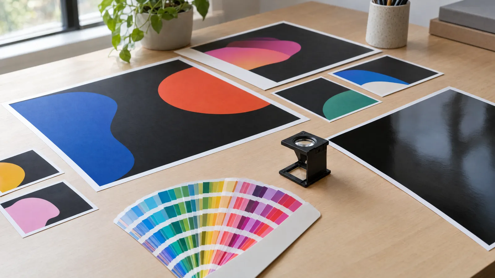
A large black area in 100K is the most common cause of ‘the black came out grey’ complaints. On a poster, cover or black business card, use rich black such as 60/40/40/100. Make sure the whole background uses one and the same black definition. If you place 100K and rich black side by side, the difference will be clearly visible as two patches of different tone.
In large-format printing (banners, roller banners, signs), inkjet machines have no registration problems. The challenge there is the amount of ink on the material. Some printers ask for rich black in files, while others prefer 100K and build the black themselves in the RIP. The right choice depends on the machine profile and the type of material. For large black areas, ask your printer for advice or order a test print of a section.
On folded and creased products such as invitations and menus, heavy black cracks along the fold and reveals the white paper underneath. Creasing before folding helps. So does lamination, which also protects the black background from scratches and fingerprints, especially with matt laminate.
White and coloured text on a black background
White text on a black background is a knockout in the inks. Nothing is printed in that area, so the colour of the paper forms the letter. When the background is four-colour, every ink has to align exactly with the edge of the letter. With small letters, misregistration floods them with a coloured fringe and fine serifs disappear.
So on rich black, make white text larger and bolder than you would on a white background. For small elements there's also a technique in which the CMY components are pulled back by about 0.2–0.3 mm from the edge of the knockout. Only K100 remains right next to the letter, which makes slight misregistration invisible.
- White text on rich black: at least about 8–9 pt, in a sans-serif typeface of medium or heavy weight.
- Avoid thin typefaces and Light weights when reversed out.
- Coloured text on a black background needs a knockout in the background, so don't set it to overprint.
- White objects must never be set to overprint, or they will disappear from the print.
- On uncoated paper, increase the size and weight of reversed-out text, because the ink spreads.
How to set up and check black in your print file
Most errors arise during conversion from RGB. Black text set as RGB 0/0/0 turns into four-colour black when converted to CMYK, often totalling close to 300%. So design in CMYK mode from the start and create two black swatches: ‘Text 100K’ and ‘Background rich black’. Be careful when exporting from office software and some online tools, as text can end up in the PDF as four-colour black.
Before sending the file, open the PDF in a program with separations preview, such as Output Preview in Acrobat Pro. Turn off the K channel. If the text is still visible, it's built from CMY. You can also check total ink coverage in the darkest areas there. In Adobe programs, set black to display accurately. By default, 100K and rich black look identical on screen.
If you order a ready-made design, for example from plakaty.shop (wielkareklama.eu studio), you'll receive a print-ready PDF with 3 mm bleed and a safe margin. Even so, it's worth checking it in the separations preview. Read through all the text, numbers and addresses yourself before printing.
- Convert black photos and raster graphics using the profile specified by your printer, as the profile keeps within the ink coverage limit automatically.
- Don't manually push the blacks in a photo up to 100/100/100/100.
- Prepare a logo with black lettering in two versions: 100K for small uses and rich black for large areas.
The most common mistakes with black
Most problems with black only show up on the print. A monitor doesn't show the difference between types of black, nor whether the ink limit has been exceeded. These are the mistakes that crop up most often in files.
- Registration black in text or backgrounds: 400% ink, smudging and sheets sticking together.
- Small text in rich black: coloured fringes and illegible letters.
- Large background in 100K: a grey, uneven-looking area.
- Mixing 100K and rich black in one background: two visible patches.
- Black text from RGB 0/0/0: unintended four-colour black.
- No bleed on a black background: a white edge after trimming.
- Heavy black across a fold without creasing: cracked ink.
Checklist
- Text below about 12 pt, lines and QR codes are in 100K
- Large black backgrounds use a single rich black definition, e.g. 60/40/40/100
- Total ink in the darkest area is within the printer's limit
- The file contains no registration black except in crop marks
- White text on black is at least about 8–9 pt in a heavier typeface
- White objects are not set to overprint
- The black background extends into the 3 mm bleed
- The separations preview confirms that text is in the K channel only
- All text, phone numbers and addresses have been proofread
FAQs
Which CMYK values should I use for rich black?
The most common choice is C60 M40 Y40 K100, which is 240% total ink and within the limits of almost any paper. For a cooler tone increase the cyan; for a warmer one increase the magenta and yellow. If your printer provides its own recipe, use that.
Why did my black background print grey?
The background was most likely set as 100K black, which looks like dark grey over a large area. On uncoated paper the effect is even stronger, because the ink soaks in. For large backgrounds, use rich black with added CMY.
Can black text be RGB 0,0,0?
Not for print. When converted to CMYK it becomes four-colour black totalling about 300%. Small letters will then print blurred, with coloured fringes. Set text as C0 M0 Y0 K100 in a CMYK document.
What is the ink coverage limit and what is it?
It's the maximum combined percentage of C+M+Y+K at any one point on the print. In offset on coated paper it's usually 300–330%, on uncoated 260–300% and on newsprint about 240–260%. The exact value is set by the colour profile and the printer's specification.
Should I use rich black on banners and roller banners?
Usually yes for large black areas, because 100K can look pale on large-format materials. It does depend on the machine profile and the material, though. Some printers prefer 100K and build the black themselves in the RIP. Keep small text in 100K, even on a banner.
What is registration black?
It's the colour 100/100/100/100, which prints on every plate and is meant only for crop marks and registration marks. It lays down 400% ink, so if used in a design it causes smudging, sheets sticking together and cracking along folds. Never use it in text or backgrounds.