10 Event Poster Ideas for Concerts, Gigs and Fêtes
A good event poster is built on one strong concept (for example, big typography, a photo of the artist, an illustration or a single bold colour) and four essential pieces of information: what, where, when and how to get tickets. For print, prepare an A3 (297×420 mm) or A2 (420×594 mm) file at 300 DPI, in CMYK, with 3 mm bleed, on 130–170 g/m² coated paper (indoors) or roughly 115 g/m² blueback (for pasting on hoardings and poster sites), with the title at around 60–80 pt and the date no smaller than about 24 pt on A3. For online use, create separate 1080×1080 px (post) and 1080×1920 px (Stories) versions rather than simply shrinking the poster.
An event poster has a few seconds to stop a passer-by and tell them the essentials: what's on, where, when and how much. Below you'll find 10 tried-and-tested design concepts, a list of details that must never be left out, advice on choosing format and paper, and a way to carry the design over to social media without losing legibility.
What information must an event poster include?
Before you choose a concept, write out the copy. The most common mistake is adding information at the end, once the layout is already finished – the text then ends up squeezed into a corner in small print. Set a clear hierarchy: one thing biggest (usually the name of the event or performer), then the date and venue, and finally the details.
Every extra element reduces the legibility of the whole. If the list of attractions is long, pick the three strongest and move the rest to a website, adding a QR code that links to it.
- What: the name of the event, the performer or the main attraction.
- When: day of the week, date and start time (for a fête, the finish time too).
- Where: venue name and address; for outdoor events, something like 'the park on … Road'.
- Tickets: price, 'free entry' or where to buy; a website address or QR code.
- Organiser and any partners: logos in a single strip along the bottom.
- Practical information where relevant: age restrictions, accessible entrance, change of venue in case of rain.
10 event poster ideas
Choose one concept and stick to it consistently. Combining three ideas on one sheet usually produces chaos that looks like a blur from a few metres away.
- Typography as the hero – the event or band name set in a huge typeface across the full width of the poster, with the rest of the information in calm, smaller text. It works even in two colours and adapts easily to a square format.
- A large photo of the artist – one striking, tightly cropped photo with a plain background that leaves room for text. Make sure you have the photographer's or artist's permission to use the image in print.
- A themed illustration – a drawing of a carousel, a stage strung with fairy lights or market stalls works well for family fêtes. A vector illustration loses no quality when enlarged to A1 or banner size.
- Colour as a signal – one intense background (yellow, pink, orange) with black text. Remember that neon colours on screen come out duller in standard CMYK, so if you want that effect, ask the printer about a spot colour or fluorescent ink.
- Retro and nostalgia – a limited palette, grain and typefaces in the style of old playbills. Ideal for tea dances, dinner dances and concerts of music from bygone decades.
- A line-up in hierarchy – with many performers, the headliner is largest and the others follow in progressively smaller rows, split by day. Readers find their band straight away.
- The date as the graphic – large figures for the day and month become the main motif, with the event name completing the composition. A good choice when the date is the most important information, such as for an annual town festival.
- Minimalism with a single symbol – one object (a guitar, a musical note, a leaf) on a plain background with plenty of white space. It looks elegant for intimate concerts and private views.
- Collage and cut-outs – photos, paper textures, tape and hand lettering. Suits the alternative and punk scenes as well as creative workshops.
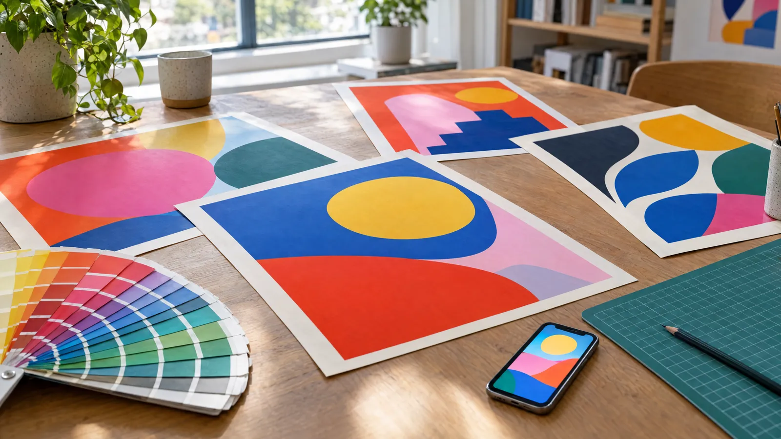
- A poster series – several versions in the same style, differing in colour or performer, hung side by side. It builds recognition for a series of events and immediately gives you material for several posts.
Which idea suits which event?
The right concept depends on the audience and where the poster will hang. A poster on a busy town-centre poster site competes with dozens of others, so it needs contrast; a poster in a café or school can be calmer.
| Event | Suitable concepts | What to watch out for |
|---|---|---|
| Club gig | Typography, artist photo, collage | Performer's name legible from several metres |
| Multi-artist festival | Line-up in hierarchy, poster series | Split by day, no more than a few type sizes |
| Family fête, town festival | Illustration, colour as a signal, date as the graphic | Children's activities and entry information |
| Intimate concert, private view | Minimalism, typography | Time and address mustn't get lost in the white space |
| Dance, themed party | Retro, colour as a signal | Style mustn't compromise the legibility of the date |
Which format and paper should you choose for print?
The format depends on where the poster will be displayed. A4 and A3 work well in shop windows, on noticeboards and in venues; A2 and A1 on poster sites, in display cases and at entrances. B1 (700×1000 mm) is a common format for street poster sites and display cases in many countries – check the exact size with whoever manages the site.
For indoor use, choose 130–170 g/m² coated paper: matt where lighting causes glare, gloss for more vivid colours. For pasting onto poster sites and walls, blueback paper of around 115 g/m² is used – its blue reverse stops old posters showing through. Outdoors without a display case, synthetic paper or a laminated print will perform better.
| Format | Trimmed size (mm) | Typical location | Approximate title size |
|---|---|---|---|
| A4 | 210×297 | Noticeboard, venue door | 40–60 pt |
| A3 | 297×420 | Shop window, café, school | 60–80 pt |
| A2 | 420×594 | Display case, foyer, bus shelter | 90–120 pt |
| A1 | 594×841 | Poster site, event entrance | 130 pt and above |
| B1 | 700×1000 | Street poster site, large display case | 150 pt and above |
How do you prepare a poster file for print?
Design at the final format from the start, or in a proportion that scales to it (all A formats share the same proportion). A resolution of 300 DPI at 1:1 scale is standard for A4–A2; for A1 and B1, which are viewed from further away, 150–200 DPI is usually enough, but this depends on the printer's requirements.
Add 3 mm bleed on every side – backgrounds and images must extend beyond the trim line. Keep important text at least 5 mm from the trimmed edge (10 mm is safer on large formats). Save a PDF in CMYK, with fonts embedded or text converted to outlines.
- Set small black text as 100% K to avoid coloured fringes if registration is slightly off.
- Large black backgrounds can use rich black – ask your printer for their recommended mix.
- Print QR codes at a minimum of about 2×2 cm on A4 and larger on posters viewed from a distance, always with a white margin around them.
- Don't enlarge images taken from the internet – the low resolution will show in print.
How do you create social media versions of your poster?
A portrait A3 poster dropped into a square post loses legibility: the text becomes tiny and half the frame is empty background. It's better to redesign the layout – keep the same motif, colours and typeface, but cut the text down to the name, date, venue and link. Save files for online use in RGB, as PNG or JPG.
In Stories (1080×1920 px), leave about 250 px clear at the top and bottom, as interface elements cover these areas. If you need a full set of versions at once, the 'Small Campaign' package at plakaty.shop costs €35 and gives you 6 different design proposals that you can adapt into a poster, a post and a Story.
| Version | Size | What to include |
|---|---|---|
| Square post | 1080×1080 px | Motif, name, date, venue |
| Portrait post | 1080×1350 px | As for the square post, with more room for the graphic |
| Stories | 1080×1920 px | Large title, date, link or countdown sticker |
| Landscape banner | e.g. 2400×1200 px | Website header, event cover image, newsletter |
The most common mistakes on event posters
Most unsuccessful posters don't fail because of ugly graphics, but because of poor legibility and missing information. Before you send the file to the printer, step back from the monitor or shrink the preview to the size of a postage stamp – if you can't see the date and name, neither will a passer-by.
- No year or day of the week alongside the date, causing confusion for recurring events.
- Text placed over a photo without a backing panel or darkening – it gets lost in the background detail.
- More than two typefaces and a dozen or so text sizes.
- Sponsors' logos larger than the event information.
- Typos in the performer's name, the address or the phone number.
Checklist
- Event name, date with day of the week, time and address are legible from several metres
- Ticket information or 'free entry' appears on the poster
- All wording, phone numbers and addresses proofread word by word
- 3 mm bleed and a safety margin of at least 5 mm
- PDF file in CMYK, 300 DPI (150–200 DPI for A1/B1), fonts embedded
- QR code scanned with a phone from a test print
- Paper suited to the location: coated for indoors, blueback for poster sites
- 1080×1080 and 1080×1920 px versions prepared in RGB
FAQs
What size poster should I choose for a concert?
For venues and shop windows, A3 (297×420 mm) is usually enough; for poster sites and display cases, A2, A1 or B1 are better. If the poster will hang in several places, design it in the A-format proportion – that way you can scale the same file without changing the layout.
What must an event poster include?
Essentials: what's happening, when (date, day of the week, time), where (venue and address) and ticket or free-entry information. It's worth adding the organiser, a website address or QR code and, for outdoor events, what happens in case of rain.
What resolution should a poster for print be?
The standard is 300 DPI at the actual print size, with 3 mm bleed added. For large formats viewed from a distance, such as A1 or B1, 150–200 DPI is often enough, but the printer will give you the final requirements.
What paper are posters for outdoor poster sites printed on?
Most often on blueback paper of around 115 g/m², which has a blue reverse and stops old posters underneath from showing through. For indoor use and display cases, 130–170 g/m² coated paper is better.
Can I use the same poster file on Instagram and Facebook?
Technically yes, but a portrait poster in a square post becomes hard to read. It's better to prepare separate 1080×1080 px and 1080×1920 px versions with the same motif and shorter text, saved in RGB.